package com.mkyong.android;

import android.app.Activity;
import android.os.Bundle;
import android.view.View;
import android.view.View.OnClickListener;
import android.widget.Button;
import android.widget.RadioButton;
import android.widget.RadioGroup;
import android.widget.Toast;

public class MyAndroidAppActivity extends Activity {

  private RadioGroup radioSexGroup;
  private RadioButton radioSexButton;
  private Button btnDisplay;

  @Override
  public void onCreate(Bundle savedInstanceState) {
	super.onCreate(savedInstanceState);
	setContentView(R.layout.main);

	addListenerOnButton();

  }

  public void addListenerOnButton() {

	radioSexGroup = (RadioGroup) findViewById(R.id.radioSex);
	btnDisplay = (Button) findViewById(R.id.btnDisplay);

	btnDisplay.setOnClickListener(new OnClickListener() {

		@Override
		public void onClick(View v) {

		        // get selected radio button from radioGroup
			int selectedId = radioSexGroup.getCheckedRadioButtonId();

			// find the radiobutton by returned id
		        radioSexButton = (RadioButton) findViewById(selectedId);

			Toast.makeText(MyAndroidAppActivity.this,
				radioSexButton.getText(), Toast.LENGTH_SHORT).show();

		}

	});

  }
}
Tag Archives: android
Android get type of a view
if (view instanceof ImageView) {
    ImageView imageView = (ImageView) view;
    // do what you want with imageView
}
else if (view instanceof TextView) {
    TextView textView = (TextView) view;
    // do what you want with textView
}
else if ...
Or View view=FLall.getChildAt(i);
Log.i("ViewName",getClass().getName()); Android Toast
An Android Toast is a small message displayed on the screen, similar to a tool tip or other similar popup notification. A Toast is displayed on top of the main content of an activity, and only remains visible for a short time period. This screenshot shows how a Toast looks like on the screen:
 The
The Toast is shown at the bottom of the screen in the above screenshot (but you can change that).
Creating a Toast
Here is an Android Toast example:
Toast toast = Toast.makeText(getApplicationContext(),
        "This is a message displayed in a Toast",
        Toast.LENGTH_SHORT);

toast.show();
The Toast.makeText() method is a factory method which creates a Toast object. The method takes 3 parameters. First the methods needs a Context object which is obtained by calling getApplicationContext(). Note: The getApplicationContext() method is a method that exists inside activities, so the above code has to be located in an Activity subclass to work.
The second parameter is the text to be displayed in the Toast. The third parameter is the time duration the Toast is to be displayed. The Toast class contains two predefined constants you can use: Toast.LENGTH_SHORT and Toast.LENGTH_LONG. You will have to experiment with these two values to see which fits your situation better.
Toast Positioning
You can change the positioning on the screen of a Toast message using the setGravity() method. Here is a Toast setGravity() example:
toast.setGravity(Gravity.CENTER, 0, 0);
The first parameter of the setGravity() method specifies the overall position of the Toast. You can use the following constants in the Gravity class to specify the overall position:
TOPBOTTOMLEFTRIGHTCENTERCENTER_HORIZONTALCENTER_VERTICAL
Each of these constants defines the position in either the X or Y direction, except for the CENTER constant which implies centered both horizontally and vertically. You can combine these constants using the | (or) operator, like this:
toast.setGravity(Gravity.TOP | Gravity.CENTER_HORIZONTALLY, 0, 0);
The two other parameters of the setGravity() method are an X and Y offset to the position defined by the Gravity constant. If, for instance, you need the Toast to be displayed at the top, centered horizontally, but 20 pixels down from the top position, you would use this setGravity() call:
toast.setGravity(Gravity.TOP | Gravity.CENTER_HORIZONTALLY, 0, 20);
Toast Custom Views
It is possible to define a custom View for your Toast. To do so, first you must create a layout XML file for the custom View. Here is an example Toast layout XML file:
<?xml version="1.0" encoding="utf-8"?>
    <LinearLayout xmlns:android="http://schemas.android.com/apk/res/android"
                  android:id="@+id/toast_root_view"
                  android:orientation="vertical" android:layout_width="match_parent"
                  android:layout_height="match_parent"
                  android:background="@android:color/background_dark"
                  android:padding="16dp"
            >

        <TextView
                android:id="@+id/toast_header"
                android:textSize="20dp"
                android:textColor="@android:color/primary_text_dark"
                android:layout_width="match_parent"
                android:layout_height="match_parent" />

        <TextView
                android:id="@+id/toast_body"
                android:textColor="@android:color/primary_text_dark"
                android:layout_width="match_parent"
                android:layout_height="match_parent" />

    </LinearLayout>
Put this layout XML file into your Android project’s /app/src/main/res/layout directory and name the file my_toast.xml .
To use this layout XML file with a Toast you write this code:
LayoutInflater inflater = getLayoutInflater();

View toastLayout = inflater.inflate(R.layout.my_toast,
        (ViewGroup) findViewById(R.id.toast_root_view));

TextView header = (TextView) toastLayout.findViewById(R.id.toast_header);
header.setText("Message for you:");

TextView body = (TextView) toastLayout.findViewById(R.id.toast_body);
body.setText("You have got mail!");

Toast toast = new Toast(getApplicationContext());
toast.setGravity(Gravity.CENTER, 0, 0);
toast.setDuration(Toast.LENGTH_LONG);
toast.setView(toastLayout);
toast.show();
First you obtain the LayoutInflater. You use that to inflate (create) the View defined by your the layout XML file named my_toast.xml (referred to by R.layout.my_toast).
Notice the findViewById(R.id.toast_root_view) call as the second parameter to the inflate() method call. This finds the root ViewGroup in the my_toast.xml layout XML file (the root ViewGroup has the id toast_view_group). This call is necessary for the inflated View to know what the root ViewGroup inside the inflated View is.
Once the View is created, you obtain the two TextView components from the View and set their texts.
Finally, you create a Toast object, set its gravity (position / alignment), its duration, its View and then show it.
Here is how the Toast above looks when displayed:

Android User Interface Design: Relative Layouts
Understanding layouts is important for good Android application design. In this tutorial, you learn all about relative layouts, which organize user interface controls, or widgets, on the screen in relation to one another, or to their parent layout. When used correctly, relative layouts can be the powerful and flexible layout upon which many interesting Android application user interfaces can be designed.
What Is A Relative Layout?
After linear layouts, which display controls in a single row or column, relative layouts are one of the more common types of layouts used by Android user interface designers. Much like other layouts, relative layouts can be defined within XML layout resources or programmatically in the application’s Java code. The relative layout works much as its name implies: it organizes controls relative to one another, or to the parent control itself.
What does this mean? It means that child controls, such as ImageView, TextView ,and Button controls, can be placed above, below, to the left or right, of one another. Child controls can also be placed in relation to the parent (the relative layout container), including placement of controls aligned to the top, bottom, left or right edges of the layout.
Relative layout child control placement is defined using rules. These rules define how the controls within the relative layout are displayed. For the complete list of rules for relative layouts, see the Android SDK documentation for the RelativeLayout class. The associated XML attributes for use in XML resources are also defined in the documentation.
NOTE: Rules require that each child control has its id attribute set properly.
A Simple Relative Layout
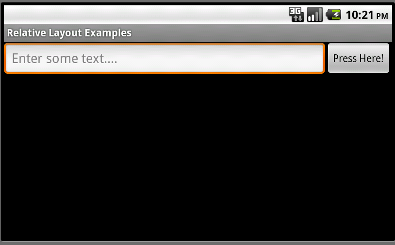
Relative layouts are best explained using an example. Let’s say we want to design a screen with an EditText control and a Button control. We want the Button to display to the right of the EditText control. Therefore, we could define a relative layout with two child controls: the EditText and the Button. The EditText control might have a rule that says: align this control in the to the left-hand side of the parent control (the layout) and to the left of a second control-a Button control. Meanwhile, the Button control might have a rule that says: align this control to the right-hand side of the parent control (the layout).
The following figures show just such a relative layout, displayed in portrait or landscape mode. The relative layout has two child controls: an EditText control and a Button control.

Defining an XML Layout Resource with a Relative Layout
The most convenient and maintainable way to design application user interfaces is by creating XML layout resources. This method greatly simplifies the UI design process, moving much of the static creation and layout of user interface controls and definition of control attributes, to the XML, instead of littering the code.
XML layout resources must be stored in the /res/layout project directory hierarchy. Let’s take a look at the relative layout introduced in the previous section. This layout resource file, aptly named /res/layout/relative.xml, is defined in XML as follows:
|
01
02
03
04
05
06
07
08
09
10
11
12
13
14
15
16
17
18
19
|
<?xml version="1.0" encoding="utf-8"?><RelativeLayout android:layout_height="fill_parent" android:layout_width="fill_parent"> <EditText android:id="@+id/EditText01" android:hint="Enter some text..." android:layout_alignParentLeft="true" android:layout_width="fill_parent" android:layout_toLeftOf="@+id/Button01" android:layout_height="wrap_content"></EditText> <Button android:id="@+id/Button01" android:text="Press Here!" android:layout_width="wrap_content" android:layout_alignParentRight="true" android:layout_height="wrap_content"></Button></RelativeLayout> |
Recall that, from within the Activity, only a single line of code within the onCreate() method is necessary to load and display a layout resource on the screen. If the layout resource was stored in the /res/layout/relative.xml file, that line of code would be:
setContentView(R.layout.relative);
This relative layout has its width and height set to fill the screen and three rules configured on its child controls:
- EditText01: Align to the left-hand side of the layout
- EditText01: Display to the left of Button01
- Button01: Align to the right-hand side of the layout
Defining a Relative Layout Programmatically
You can also programmatically create and configure relative layouts. This is done using the RelativeLayout class (android.widget.Relative). You’ll find the child-specific parameters in the RelativeLayout.LayoutParams class. Also, the typical layout parameters (android.view.ViewGroup.LayoutParams), such as layout_height and layout_width, as well as margin parameters (ViewGroup.MarginLayoutParams), still apply to RelativeLayout objects.
Instead of loading a layout resource directly using the setContentView() method as shown earlier, you must instead build up the screen contents in Java and then supply a parent layout object which contains all the control contents to display as child views to the setContentView() method. In this case, your parent layout would be the relative layout.
For example, the following code illustrates how to programmatically have an Activity instantiate a RelativeLayout and place a TextView and a Button control within it in its onCreate() method, much like the one shown in the previous section:
public void onCreate(Bundle savedInstanceState) {
    super.onCreate(savedInstanceState);
    // setContentView(R.layout.relative);

        EditText ed = new EditText(this);
        RelativeLayout.LayoutParams params = new RelativeLayout.LayoutParams(LayoutParams.FILL_PARENT,
                LayoutParams.WRAP_CONTENT);
        params.addRule(RelativeLayout.ALIGN_PARENT_LEFT);
        // use same id as defined when adding the button
        params.addRule(RelativeLayout.LEFT_OF, 1001);
        ed.setLayoutParams(params);
        ed.setHint("Enter some text....");

        Button but1 = new Button(this);
        RelativeLayout.LayoutParams params2 = new RelativeLayout.LayoutParams(LayoutParams.WRAP_CONTENT,
                LayoutParams.WRAP_CONTENT);
        params2.addRule(RelativeLayout.ALIGN_PARENT_RIGHT);
        but1.setLayoutParams(params2);
        but1.setText("Press Here!");
        // give the button an id that we know
        but1.setId(1001);
        RelativeLayout layout1 = new RelativeLayout(this);
        layout1.setLayoutParams(new LayoutParams(LayoutParams.FILL_PARENT, LayoutParams.FILL_PARENT));
        layout1.addView(ed);
        layout1.addView(but1);
        setContentView(layout1);
}
Let’s take a closer look at the Java code listing above. First we create an EditText control as normal. We give it some RelativeLayout parameters, and then set its rules. In this case, we create two rules for the EditText control.
Next, we create a Button control and set its rule (align to the right-hand edge of the parent layout). Finally, we create a RelativeLayout object, set its parameters, add the two child controls using the addView() method and load the relative layout to display using the setContentView() method.
As you can see, the code can rapidly grow in size as more controls are added to the screen. For organization and maintainability, defining and using layouts programmatically is best left for the odd case rather than the norm.
Exploring the Important Relative Layout Properties and Attributes
Now let’s talk a bit about the attributes that help configure a relative layout and its child controls. Some specific attributes apply to relative layouts-namely the child rules, including:
- Rules for child control centering within the parent layout, including: center horizontally, center vertically, or both.
- Rules for child control alignment within the parent layout, including: align with top, bottom, left or right edge of another control.
- Rules for child control alignment in relation to other child controls, including: align with top, bottom, left or right edge.
- Rules for child control placement in relation to other child controls, including: placement to the left or right of a specific control, or above or below another control.
Also, general ViewGroup-style attributes apply to relative layouts. These include:
- Generic Layout Parameters such as layout_height (required) and layout_width (required) (class: ViewGroup.LayoutParams)
- Margin Layout Parameters such as margin_top, margin_left, margin_right and margin_bottom (class: ViewGroup. MarginLayoutParams)
- Layout Parameters such as layout_height and layout_width (class: ViewGroup.LayoutParams)
Now let’s put some of these rules into action!
Working with Layout Rules
Let’s look at a more complex screen design. For the purposes of this exercise, we will start by looking at the final screen design, and then will work backwards, discussing the relative layout features and rules used to achieve this final result.
Let’s say we want to design a screen that looks like this:

In order to design this screen using a relative layout, continue with the following steps.
Step 1: Define a Relative Layout in Your XML Resource File
First, define a relative layout in your XML resource file. Since you want this layout to control the contents of the entire screen, set its height and width attributes to fill_parent. Your XML resource file should now look something like this:
|
1
2
3
4
5
6
7
|
<?xml version="1.0" encoding="utf-8"?><RelativeLayout android:layout_height="fill_parent" android:layout_width="fill_parent"></RelativeLayout> |
Step 2: Determine Child Controls
Next, we determine what child controls we need. In this case, we need seven TextView controls (one for each color). Configure them as you normally would, setting text attributes to strings, background colors, font sizes, etc. Place each of these controls within your relative layout.
Step 3: Define Relative Layout Rules
Next, we define the rules for each child control, in order to get them to draw in the appropriate places:
- The RED TextView control has no specific settings configured. By default, this control will be drawn in the upper left-hand corner of the parent layout.
- The ORANGE TextView control is centered horizontally in the parent layout. Because all controls default to the top left-hand corner of the screen, this effectively anchors the control to the top middle edge of the parent layout.
- The YELLOW TextView control is aligned to the right-hand edge of the parent layout. Because all controls default to the top left-hand corner of the screen, this effectively anchors the control to the top right corner of the parent layout.
- The GREEN TextView control is centered vertically within the parent layout and configured to display to the left of the BLUE TextView control.
- The BLUE TextView control is aligned to the center (horizontally and vertically) of the parent control. This displays it in the middle of the screen.
- The INDIGO TextView control is centered vertically within the parent layout and configured to display to the right of the BLUE TextView control.
- The VIOLET TextView control is aligned to the bottom edge of the parent layout. It’s width is also set to fill the parent, allowing it to stretch across the bottom edge of the screen.
If you define these rules in your XML resource file, it should now look something like this:
|
001
002
003
004
005
006
007
008
009
010
011
012
013
014
015
016
017
018
019
020
021
022
023
024
025
026
027
028
029
030
031
032
033
034
035
036
037
038
039
040
041
042
043
044
045
046
047
048
049
050
051
052
053
054
055
056
057
058
059
060
061
062
063
064
065
066
067
068
069
070
071
072
073
074
075
076
077
078
079
080
081
082
083
084
085
086
087
088
089
090
091
092
093
094
095
096
097
098
099
100
101
102
|
<?xml version="1.0" encoding="utf-8"?><RelativeLayout android:layout_height="fill_parent" android:layout_width="fill_parent"> <TextView android:text="RED" android:id="@+id/TextView01" android:layout_height="wrap_content" android:background="#f00" android:gravity="center" android:textColor="#000" android:layout_width="wrap_content" android:padding="25dp"></TextView> <TextView android:text="ORANGE" android:layout_height="wrap_content" android:background="#ffa500" android:gravity="center" android:textColor="#000" android:id="@+id/TextView02" android:layout_width="wrap_content" android:layout_centerHorizontal="true" android:padding="25dp"></TextView> <TextView android:text="YELLOW" android:layout_height="wrap_content" android:background="#ffff00" android:gravity="center" android:textColor="#000" android:id="@+id/TextView03" android:layout_width="wrap_content" android:layout_alignParentRight="true" android:padding="25dp"></TextView> <TextView android:text="GREEN" android:layout_height="wrap_content" android:background="#0f0" android:gravity="center" android:textColor="#000" android:id="@+id/TextView04" android:layout_width="wrap_content" android:layout_toLeftOf="@+id/TextView05" android:padding="25dp" android:layout_centerVertical="true"></TextView> <TextView android:text="BLUE" android:layout_height="wrap_content" android:background="#00f" android:gravity="center" android:textColor="#fff" android:id="@+id/TextView05" android:layout_width="wrap_content" android:layout_centerInParent="true" android:layout_margin="10dp" android:padding="25dp"></TextView> <TextView android:text="INDIGO" android:layout_height="wrap_content" android:gravity="center" android:textColor="#fff" android:id="@+id/TextView06" android:layout_width="wrap_content" android:layout_toRightOf="@+id/TextView05" android:background="#4b0082" android:padding="25dp" android:layout_centerVertical="true"></TextView> <TextView android:text="VIOLET" android:layout_height="wrap_content" android:background="#ee82ee" android:gravity="center" android:textColor="#000" android:id="@+id/TextView07" android:layout_alignParentBottom="true" android:layout_width="fill_parent" android:padding="25dp"></TextView></RelativeLayout> |
RelativeLayout Usage Tips
Here are some tips for working with relative layouts.
- Relative layout child controls must have unique id attributes for rules to apply correctly.
- Watch out for circular rules. Circular rules occur when two controls have rules that point at one another. If you include a circular set of rules in your layout design, you’ll get the following error:
IllegalStateException: Circular dependencies cannot exist in a RelativeLayout
It can be helpful to recall that the relative layout rules are applied in one pass.
- Keep your relative layout rules to a minimum. This helps reduce the chance of circular rules and makes your layout more manageable and flexible.
- As usual, remember to test that your layout design works as expected in both portrait and landscape modes, as well as on different screen sizes and resolutions.
- Use relative layouts instead of nesting linear layouts to improve application performance and responsiveness.
Conclusion
Android application user interfaces are defined using layouts, and relative layouts are one of the layout types used to make application screens that are both flexible and powerful. The relative layout allows child controls to be organized in relative to one another and relative to the parent (edges and centered vertically and horizontally). Once you master the rules of how relative layouts, they can be incredibly versatile, allowing you to create complex layouts without the overhead of nesting different layouts, thus improving performance.
Android Drawing Separator/Divider Line in Layout
<View
    android:layout_width="fill_parent"
    android:layout_height="1dp"
android:background="@android:color/darker_gray"/>Using lists in Android (ListView) – Tutorial
Lars Vogel
Version 4.6
Copyright © 2010, 2011, 2012, 2013, 2014 vogella GmbH
20.11.2014
Using Android ListView, ListActivity and ListFragment
This tutorial describes how to use the ListView view together with Activities and Fragments in Android. The tutorial is based on Eclipse 4.4, Java 1.7 and Android 5.0.
1. Android and Lists
The display of elements in a list is a very common pattern in mobile applications. The user sees a list of items and can scroll through them. Such an activity is depicted in the following picture.

Typically the user interacts with the list via the action bar, for example, via a refresh button. Individual list items can be selected. This selection can update the action bar or can trigger a detailed screen for the selection. The following graphic sketches that. On the selection of a list item another activity is started.

Android provides the ListView and the ExpandableListView classes which is capable of displaying a scrollable list of items.
The ExpandableListView class supports a grouping of items.
The input to the list (items in the list) can be arbitrary Java objects. The adapter extracts the correct data from the data object and assigns this data to the views in the row of the ListView.
These items are typically called the data model of the list. An adapter can receive data as input.
An adapter manages the data model and adapts it to the individual entries in the widget. An adapter extends the BaseAdapter class.
Every line in the widget displaying the data consists of a layout which can be as complex as you want. A typical line in a list has an image on the left side and two text lines in the middle as depicted in the following graphic.

A layout file for a such a line might look like the following.
<RelativeLayout xmlns:android="http://schemas.android.com/apk/res/android"
    android:layout_width="fill_parent"
    android:layout_height="?android:attr/listPreferredItemHeight"
    android:padding="6dip" >

    <ImageView
        android:id="@+id/icon"
        android:layout_width="wrap_content"
        android:layout_height="fill_parent"
        android:layout_alignParentBottom="true"
        android:layout_alignParentTop="true"
        android:layout_marginRight="6dip"
        android:contentDescription="TODO"
        android:src="@drawable/ic_launcher" />

    <TextView
        android:id="@+id/secondLine"
        android:layout_width="fill_parent"
        android:layout_height="26dip"
        android:layout_alignParentBottom="true"
        android:layout_alignParentRight="true"
        android:layout_toRightOf="@id/icon"
        android:ellipsize="marquee"
        android:singleLine="true"
        android:text="Description"
        android:textSize="12sp" />

    <TextView
        android:id="@+id/firstLine"
        android:layout_width="fill_parent"
        android:layout_height="wrap_content"
        android:layout_above="@id/secondLine"
        android:layout_alignParentRight="true"
        android:layout_alignParentTop="true"
        android:layout_alignWithParentIfMissing="true"
        android:layout_toRightOf="@id/icon"
        android:gravity="center_vertical"
        android:text="Example application"
        android:textSize="16sp" />

</RelativeLayout>
The adapter would inflate the layout for each row in its getView() method and assign the data to the individual views in the row.
The adapter is assigned to the ListView via the setAdapter method on the ListView object.
Tip
Adapters are not only used by ListView, but also by other views which extend AdapterView as, for example, Spinner, GridView, Gallery and StackView.
Filtering and sorting of the data is handled by the adapter. You need to implement the logic in your custom adapter implementation.
The notifyDataSetChanged() method on the adapter is called if the data has changed or if new data is available.
The notifyDataSetInvalidated() method is called if the data is not available anymore.
To react to selections in the list, set an OnItemClickListener to your ListView.
listView.setOnItemClickListener(new OnItemClickListener() {
  @Override
  public void onItemClick(AdapterView<?> parent, View view,
    int position, long id) {
    Toast.makeText(getApplicationContext(),
      "Click ListItem Number " + position, Toast.LENGTH_LONG)
      .show();
  }
});
Android provides default adapter implementations; the most important are ArrayAdapter and CursorAdapter.
ArrayAdapter can handle data based on Arrays or java.util.List.
SimpleCursorAdapter can handle database related data.
The ArrayAdapter class can handle a list or array of Java objects as input. Every Java object is mapped to one row. By default, it maps the toString() method of the object to a view in the row layout.
You can define the ID of the view in the constructor of the ArrayAdapter otherwise the android.R.id.text1 ID is used as default.
The ArrayAdapter class allows to remove all elements in its underlying data structure with the clear() method call. You can then add new elements via the add() method or a Collection via the addAll() method.
You can also directly modify the underlying data structure and call the notifyDataSetChanged() method on the adapter to notify it about the changes in data.
Warning
If you want to change the data in your adapter, the underlying data structure must support this operation. This is, for example, the case for the ArrayList class, but not for arrays.
The following listing shows a layout file called activity_listviewexampleactivity.xml which includes a ListView.
<ListView xmlns:android="http://schemas.android.com/apk/res/android"
    android:id="@+id/listview"
    android:layout_width="wrap_content"
    android:layout_height="wrap_content" />
The following example shows the usage of the ListView view in an activity. It uses a default layout from the Android platform for the row layout. It also demonstrates the removal of list items and uses animations for the removal.
package com.vogella.android.listview.withanimation;

public class ListViewExampleActivity extends Activity {

  @Override
  protected void onCreate(Bundle savedInstanceState) {
    super.onCreate(savedInstanceState);
    setContentView(R.layout.activity_listviewexampleactivity);

    final ListView listview = (ListView) findViewById(R.id.listview);
    String[] values = new String[] { "Android", "iPhone", "WindowsMobile",
        "Blackberry", "WebOS", "Ubuntu", "Windows7", "Max OS X",
        "Linux", "OS/2", "Ubuntu", "Windows7", "Max OS X", "Linux",
        "OS/2", "Ubuntu", "Windows7", "Max OS X", "Linux", "OS/2",
        "Android", "iPhone", "WindowsMobile" };

    final ArrayList<String> list = new ArrayList<String>();
    for (int i = 0; i < values.length; ++i) {
      list.add(values[i]);
    }
    final StableArrayAdapter adapter = new StableArrayAdapter(this,
        android.R.layout.simple_list_item_1, list);
    listview.setAdapter(adapter);

    listview.setOnItemClickListener(new AdapterView.OnItemClickListener() {

      @Override
      public void onItemClick(AdapterView<?> parent, final View view,
          int position, long id) {
        final String item = (String) parent.getItemAtPosition(position);
        view.animate().setDuration(2000).alpha(0)
            .withEndAction(new Runnable() {
              @Override
              public void run() {
                list.remove(item);
                adapter.notifyDataSetChanged();
                view.setAlpha(1);
              }
            });
      }

    });
  }

  private class StableArrayAdapter extends ArrayAdapter<String> {

    HashMap<String, Integer> mIdMap = new HashMap<String, Integer>();

    public StableArrayAdapter(Context context, int textViewResourceId,
        List<String> objects) {
      super(context, textViewResourceId, objects);
      for (int i = 0; i < objects.size(); ++i) {
        mIdMap.put(objects.get(i), i);
      }
    }

    @Override
    public long getItemId(int position) {
      String item = getItem(position);
      return mIdMap.get(item);
    }

    @Override
    public boolean hasStableIds() {
      return true;
    }

  }

}
The ArrayAdapter is limited as it supports only the mapping of toString() to one view in the row layout. To control the data assignment and to support several views, you have to create your custom adapter implementation.
For this you would extend an existing adapter implementation or subclass the BaseAdapter class directly.
Tip
Frequently you extend ArrayAdapter to write a custom adapter, as this is simpler than extending BaseAdapter directly.
The adapter needs to create a layout for each row of the list. The ListView instance calls the getView() method on the adapter for each data element. In this method the adapter creates the row layout and maps the data to the views in the layout.
This root of the layout is typically a ViewGroup (layout manager) and contains several other views , e.g., an ImageView and a TextView. The following graphic shows a list with different layouts for odd and even rows.

Within the getView() method you would inflate an XML based layout and then set the content of the individual views based on the Java object for this row. To inflate the XML layout file, you can use the LayoutInflator system service.
Note
This layout inflator service can get accessed via the getLayoutInflator() method of the activity or via the context.getSystemService(Context.LAYOUT_INFLATER_SERVICE) method call.
After the adapter inflated the layout, it searches for the relevant views in the layout and fills them with the data. The individual elements in the layout can be found via the findViewById() method call on the top level view.
The following code shows an implementation of a custom adapter. This adapter assumes that you have two png files (no.png and yes.png) in one of your res/drawable folders. The coding inflates an XML layout file, finds the relevant views in the layout and sets their content based on the input data.
package de.vogella.android.listactivity;

import android.content.Context;
import android.view.LayoutInflater;
import android.view.View;
import android.view.ViewGroup;
import android.widget.ArrayAdapter;
import android.widget.ImageView;
import android.widget.TextView;

public class MySimpleArrayAdapter extends ArrayAdapter<String> {
  private final Context context;
  private final String[] values;

  public MySimpleArrayAdapter(Context context, String[] values) {
    super(context, R.layout.rowlayout, values);
    this.context = context;
    this.values = values;
  }

  @Override
  public View getView(int position, View convertView, ViewGroup parent) {
    LayoutInflater inflater = (LayoutInflater) context
        .getSystemService(Context.LAYOUT_INFLATER_SERVICE);
    View rowView = inflater.inflate(R.layout.rowlayout, parent, false);
    TextView textView = (TextView) rowView.findViewById(R.id.label);
    ImageView imageView = (ImageView) rowView.findViewById(R.id.icon);
    textView.setText(values[position]);
    // change the icon for Windows and iPhone
    String s = values[position];
    if (s.startsWith("iPhone")) {
      imageView.setImageResource(R.drawable.no);
    } else {
      imageView.setImageResource(R.drawable.ok);
    }

    return rowView;
  }
}
Android provides specialized fragment and activity classes to simplify list handling.
The classes are the ListActivity class if you want to use lists in activities and the the ListFragment class if you want to use lists in fragments.
You do not have to assign a layout to these elements. If you do not define a layout, the activity or fragment contains a single ListView by default. ListActivity and ListFragment also allow you to override a onListItemClick() method for handling selection of list items.
Both classes allow you to set the adapter to the default ListView via the setListAdapter() method.
The following example code shows a simple ListFragment implementation.
package de.vogella.android.fragments;

import android.content.Intent;
import android.os.Bundle;
import android.view.View;
import android.widget.ArrayAdapter;
import android.widget.ListView;
import android.app.ListFragment;

public class MyListFragment extends ListFragment {

  @Override
  public void onActivityCreated(Bundle savedInstanceState) {
    super.onActivityCreated(savedInstanceState);
    String[] values = new String[] { "Android", "iPhone", "WindowsMobile",
        "Blackberry", "WebOS", "Ubuntu", "Windows7", "Max OS X",
        "Linux", "OS/2" };
    ArrayAdapter<String> adapter = new ArrayAdapter<String>(getActivity(),
        android.R.layout.simple_list_item_1, values);
    setListAdapter(adapter);
  }

  @Override
  public void onListItemClick(ListView l, View v, int position, long id) {
    // do something with the data
  }
}
The next example code demonstrates the usage of a ListActivity.
package de.vogella.android.listactivity;

import android.app.ListActivity;
import android.os.Bundle;
import android.widget.ArrayAdapter;

public class MyListActivity extends ListActivity {
  public void onCreate(Bundle icicle) {
    super.onCreate(icicle);
    String[] values = new String[] { "Android", "iPhone", "WindowsMobile",
        "Blackberry", "WebOS", "Ubuntu", "Windows7", "Max OS X",
        "Linux", "OS/2" };
    ArrayAdapter<String> adapter = new ArrayAdapter<String>(this,
        android.R.layout.simple_list_item_1, values);
    setListAdapter(adapter);
  }
}
You can use a custom layout with ListActivity or ListFragment. In this case the fragment or activity searches in the provided layout for a ListView with the pre-defined android:id attribute set to @android:id/list. This usage is demonstrated by the following code snippet.
<ListView
  android:id="@android:id/list"
  android:layout_width="match_parent"
  android:layout_height="wrap_content" >
</ListView>
Warning
If you do not use this ID or do not include a ListView into your layout, the application crashes once you try to display the activity or the fragment.
The following exercise demonstrates how to use a ListView in an ListActivity. You use the predefined ArrayAdapter class and an existing Android layout for the rows.
Create a new Android project called de.vogella.android.listactivity with the activity called MyListActivity.
Change MyListActivity class based on the the following code example. Note that the setContentView() method is not used.
package de.vogella.android.listactivity;

import android.app.ListActivity;
import android.os.Bundle;
import android.view.View;
import android.widget.ArrayAdapter;
import android.widget.ListView;
import android.widget.Toast;

public class MyListActivity extends ListActivity {
  public void onCreate(Bundle icicle) {
    super.onCreate(icicle);
    String[] values = new String[] { "Android", "iPhone", "WindowsMobile",
        "Blackberry", "WebOS", "Ubuntu", "Windows7", "Max OS X",
        "Linux", "OS/2" };
    ArrayAdapter<String> adapter = new ArrayAdapter<String>(this,
        android.R.layout.simple_list_item_1, values);
    setListAdapter(adapter);
  }

  @Override
  protected void onListItemClick(ListView l, View v, int position, long id) {
    String item = (String) getListAdapter().getItem(position);
    Toast.makeText(this, item + " selected", Toast.LENGTH_LONG).show();
  }
}

In our example your will define your layout for the rows and use it in your adapter.
Create the rowlayout.xml layout file in the res/layout folder of the de.vogella.android.listactivity project.
<?xml version="1.0" encoding="utf-8"?>
<LinearLayout xmlns:android="http://schemas.android.com/apk/res/android"
    android:layout_width="wrap_content"
    android:layout_height="wrap_content" >

    <ImageView
        android:id="@+id/icon"
        android:layout_width="22px"
        android:layout_height="22px"
        android:layout_marginLeft="4px"
        android:layout_marginRight="10px"
        android:layout_marginTop="4px"
        android:src="@drawable/ic_launcher" >
    </ImageView>

    <TextView
        android:id="@+id/label"
        android:layout_width="wrap_content"
        android:layout_height="wrap_content"
        android:text="@+id/label"
        android:textSize="20px" >
    </TextView>

</LinearLayout>
Change your activity so that is using the new layout.
package de.vogella.android.listactivity;

import android.app.ListActivity;
import android.os.Bundle;
import android.view.View;
import android.widget.ArrayAdapter;
import android.widget.ListView;
import android.widget.Toast;

public class MyListActivity extends ListActivity {
  public void onCreate(Bundle icicle) {
    super.onCreate(icicle);
    String[] values = new String[] { "Android", "iPhone", "WindowsMobile",
        "Blackberry", "WebOS", "Ubuntu", "Windows7", "Max OS X",
        "Linux", "OS/2" };
    // use your custom layout
    ArrayAdapter<String> adapter = new ArrayAdapter<String>(this,
        R.layout.rowlayout, R.id.label, values);
    setListAdapter(adapter);
  }

  @Override
  protected void onListItemClick(ListView l, View v, int position, long id) {
    String item = (String) getListAdapter().getItem(position);
    Toast.makeText(this, item + " selected", Toast.LENGTH_LONG).show();
  }
}

The following uses two images “no.png” and “ok.png”. I placed it in the “res/drawable-mdpi” folder. You must create your own icons. In case you do not find any icons just copy “icon.png” and use a drawing program to change it a little bit.
Create the class MySimpleArrayAdapter which will serve as our adapter.
package de.vogella.android.listactivity;

import android.content.Context;
import android.view.LayoutInflater;
import android.view.View;
import android.view.ViewGroup;
import android.widget.ArrayAdapter;
import android.widget.ImageView;
import android.widget.TextView;

public class MySimpleArrayAdapter extends ArrayAdapter<String> {
  private final Context context;
  private final String[] values;

  public MySimpleArrayAdapter(Context context, String[] values) {
    super(context, R.layout.rowlayout, values);
    this.context = context;
    this.values = values;
  }

  @Override
  public View getView(int position, View convertView, ViewGroup parent) {
    LayoutInflater inflater = (LayoutInflater) context
        .getSystemService(Context.LAYOUT_INFLATER_SERVICE);
    View rowView = inflater.inflate(R.layout.rowlayout, parent, false);
    TextView textView = (TextView) rowView.findViewById(R.id.label);
    ImageView imageView = (ImageView) rowView.findViewById(R.id.icon);
    textView.setText(values[position]);
    // Change the icon for Windows and iPhone
    String s = values[position];
    if (s.startsWith("Windows7") || s.startsWith("iPhone")
        || s.startsWith("Solaris")) {
      imageView.setImageResource(R.drawable.no);
    } else {
      imageView.setImageResource(R.drawable.ok);
    }

    return rowView;
  }
}
To use this adapter, change the activity to the following.
package de.vogella.android.listactivity;

import android.app.ListActivity;
import android.os.Bundle;

public class MyListActivity extends ListActivity {
  public void onCreate(Bundle icicle) {
    super.onCreate(icicle);
    String[] values = new String[] { "Android", "iPhone", "WindowsMobile",
        "Blackberry", "WebOS", "Ubuntu", "Windows7", "Max OS X",
        "Linux", "OS/2" };
    MySimpleArrayAdapter adapter = new MySimpleArrayAdapter(this, values);
    setListAdapter(adapter);
  }

}
If you run this example you should get a list with different icons for the certain elements.

Android studio 快捷键
Alt+回车 导入包,自动修正
Ctrl+N 查找类
Ctrl+Shift+N 查找文件
Ctrl+Alt+L 格式化代码
Ctrl+Alt+O 优化导入的类和包
Alt+Insert 生成代码(如get,set方法,构造函数等)
Ctrl+E或者Alt+Shift+C 最近更改的代码
Ctrl+R 替换文本
Ctrl+F 查找文本
Ctrl+Shift+Space 自动补全代码
Ctrl+空格 代码提示
Ctrl+Alt+Space 类名或接口名提示
Ctrl+P 方法参数提示
Ctrl+Shift+Alt+N 查找类中的方法或变量
Alt+Shift+C 对比最近修改的代码
Shift+F6 重构-重命名
Ctrl+Shift+先上键
Ctrl+X 删除行
Ctrl+D 复制行
Ctrl+/ 或 Ctrl+Shift+/ 注释(// 或者 )
Ctrl+J 自动代码
Ctrl+E 最近打开的文件
Ctrl+H 显示类结构图
Ctrl+Q 显示注释文档
Alt+F1 查找代码所在位置
Alt+1 快速打开或隐藏工程面板
Ctrl+Alt+ left/right 返回至上次浏览的位置
Alt+ left/right 切换代码视图
Alt+ Up/Down 在方法间快速移动定位
Ctrl+Shift+Up/Down 代码向上/下移动。
F2 或Shift+F2 高亮错误或警告快速定位
代码标签输入完成后,按Tab,生成代码。
选中文本,按Ctrl+Shift+F7 ,高亮显示所有该文本,按Esc高亮消失。
Ctrl+W 选中代码,连续按会有其他效果
选中文本,按Alt+F3 ,逐个往下查找相同文本,并高亮显示。
Ctrl+Up/Down 光标跳转到第一行或最后一行下
Ctrl+B 快速打开光标处的类或方法
最常用快捷键
1.Ctrl+E,可以显示最近编辑的文件列表
2.Shift+Click可以关闭文件
3.Ctrl+[或]可以跳到大括号的开头结尾
4.Ctrl+Shift+Backspace可以跳转到上次编辑的地方
5.Ctrl+F12,可以显示当前文件的结构
6.Ctrl+F7可以查询当前元素在当前文件中的引用,然后按F3可以选择
7.Ctrl+N,可以快速打开类
8.Ctrl+Shift+N,可以快速打开文件
9.Alt+Q可以看到当前方法的声明
10.Ctrl+W可以选择单词继而语句继而行继而函数
11.Alt+F1可以将正在编辑的元素在各个面板中定位
12.Ctrl+P,可以显示参数信息
13.Ctrl+Shift+Insert可以选择剪贴板内容并插入
14.Alt+Insert可以生成构造器/Getter/Setter等
15.Ctrl+Alt+V 可以引入变量。例如把括号内的SQL赋成一个变量
16.Ctrl+Alt+T可以把代码包在一块内,例如try/catch
17.Alt+Up and Alt+Down可在方法间快速移动
下面的不是很有用
18.在一些地方按Alt+Enter可以得到一些Intention Action,例如将”==”改为”equals()”
19.Ctrl+Shift+Alt+N可以快速打开符号
20.Ctrl+Shift+Space在很多时候都能够给出Smart提示
21.Alt+F3可以快速寻找
22.Ctrl+/和Ctrl+Shift+/可以注释代码
23.Ctrl+Alt+B可以跳转到抽象方法的实现
24.Ctrl+O可以选择父类的方法进行重写
25.Ctrl+Q可以看JavaDoc
26.Ctrl+Alt+Space是类名自动完成
27.快速打开类/文件/符号时,可以使用通配符,也可以使用缩写
28.Live Templates! Ctrl+J
29.Ctrl+Shift+F7可以高亮当前元素在当前文件中的使用
30.Ctrl+Alt+Up /Ctrl+Alt+Down可以快速跳转搜索结果
31.Ctrl+Shift+J可以整合两行
32.Alt+F8是计算变量值
IntelliJ IDEA使用技巧一览表
在使用 InelliJ IDEA 的过程中,通过查找资料以及一些自己的摸索,发现这个众多 Java 程序员喜欢的 IDE 里有许多值得一提的小窍门,如果能熟练的将它们应用于实际开发过程中,相信它会大大节省你的开发时间,而且随之而来的还会有那么一点点成就感:) Try it !
1 、写代码时用 Alt-Insert ( Code|Generate… )可以创建类里面任何字段的 getter 与 setter 方法。
2 、右键点击断点标记(在文本的左边栏里)激活速查菜单,你可以快速设置 enable/disable 断点或者条件它的属性。
3 、 CodeCompletion (代码完成)属性里的一个特殊的变量是,激活 Ctrl-Alt-Space 可以完成在或不在当前文件里的类名。如果类没有引入则 import 标志会自动创建。
4 、使用 Ctrl-Shift-V 快捷键可以将最近使用的剪贴板内容选择插入到文本。使用时系统会弹出一个含有剪贴内容的对话框,从中你可以选择你要粘贴的部分。
5 、利用 CodeCompletion (代码完成)属性可以快速地在代码中完成各种不同地语句,方法是先键入一个类名地前几个字母然后再用 Ctrl-Space 完成全称。如果有多个选项,它们会列在速查列表里。
6 、用 Ctrl-/ 与 Ctrl-Shift-/ 来注释 / 反注释代码行与代码块。
-/ 用单行注释标记(“ //… ”)来注释 / 反注释当前行或者选择地代码块。而 Ctrl-Shift-/ 则可以用块注释标记(“ ”)把所选块包围起来。要反注释一个代码块就在块中任何一个地方按 Ctrl-Shift-/ 即可。
7 、按 Alt-Q ( View|Context Info )可以不需要移动代码就能查看当前方法地声明。连续按两次会显示当前所编辑的类名。
8 、使用 Refactor|Copy Class… 可以创建一个所选择的类的“副本”。这一点很有用,比如,在你想要创建一个大部分内容都和已存在类相同的类时。
9 、在编辑器里 Ctrl-D 可以复制选择的块或者没有所选块是的当前行。
10 、 Ctrl-W (选择字)在编辑器里的功能是先选择脱字符处的单词,然后选择源代码的扩展区域。举例来说,先选择一个方法名,然后是调用这个方法的表达式,然后是整个语句,然后包容块,等等。
11 、如果你不想让指示事件细节的“亮球”图标在编辑器上显示,通过按 Alt-Enter 组合键打开所有事件列表然后用鼠标点击它就可以把这个事件文本附件的亮球置成非活动状态。
这样以后就不会有指示特殊事件的亮球出现了,但是你仍然可以用 Alt-Enter 快捷键使用它。
12 、在使用 CodeCompletion 时,可以用逗点( . )字符,逗号(,)分号(;),空格和其它字符输入弹出列表里的当前高亮部分。选择的名字会随着输入的字符自动输入到编辑器里。
13 、在任何工具窗口里使用 Escape 键都可以把焦点移到编辑器上。
Shift-Escape 不仅可以把焦点移到编辑器上而且还可以隐藏当前(或最后活动的)工具窗口。
F12 键把焦点从编辑器移到最近使用的工具窗口。
14 、在调试程序时查看任何表达式值的一个容易的方法就是在编辑器中选择文本(可以按几次 Ctrl-W 组合键更有效地执行这个操作)然后按 Alt-F8 。
15 、要打开编辑器脱字符处使用的类或者方法 Java 文档的浏览器,就按 Shift-F1 (右键菜单的 External JavaDoc )。
要使用这个功能须要把加入浏览器的路径,在“ General ”选项中设置( Options | IDE Settings ),另外还要把创建的 Java 文档加入到工程中( File | Project Properties )。
16 、用 Ctrl-F12 ( View | File Structure Popup )键你可以在当前编辑的文件中快速导航。
这时它会显示当前类的成员列表。选中一个要导航的元素然后按 Enter 键或 F4 键。要轻松地定位到列表中的一个条目,只需键入它的名字即可。
17 、在代码中把光标置于标记符或者它的检查点上再按 Alt-F7 (右键菜单中的 Find Usages… )会很快地查找到在整个工程中使用地某一个类、方法或者变量的位置。
18 、按 Ctrl-N ( Go to | Class… )再键入类的名字可以快速地在编辑器里打开任何一个类。从显示出来的下拉列表里选择类。
同样的方法你可以通过使用 Ctrl-Shift-N ( Go to | File… )打开工程中的非 Java 文件。
19 、要导航代码中一些地方使用到的类、方法或者变量的声明,把光标放在查看项上再按 Ctrl-B 即可。也可以通过按 Ctrl 键的同时在查看点上单击鼠标键调转到声明处。
20 、把光标放到查看点上再按 Ctrl-Alt-B 可以导航到一个抽象方法的实现代码。
21 、要看一个所选择的类的继承层次,按 Ctrl-H ( Browse Type Hierarchy )即可。也可以激活编辑器中的继承关系视图查看当前编辑类的继承关系。22 、使用 Ctrl-Shift-F7 ( Search | Highlight Usages in File )可以快速高亮显示当前文件中某一变量的使用地方。按 Escape 清除高亮显示。
23 、用 Alt-F3 ( Search | Incremental Search )在编辑器中实现快速查查找功能。
在“ Search for: ”提示工具里输入字符,使用箭头键朝前和朝后搜索。按 Escape 退出。
24 、按 Ctrl-J 组合键来执行一些你记不起来的 Live Template 缩写。比如,键“ it ”然后按 Ctrl-J 看看有什么发生。
25 、 Introduce Variable 整合帮助你简化代码中复杂的声明。举个例子,在下面的代码片断里,在代码中选择一个表达式:然后按 Ctrl-Alt-V 。
26 、 Ctrl-Shift-J 快捷键把两行合成一行并把不必要的空格去掉以匹配你的代码格式。
27 、 Ctrl-Shift-Backspace ( Go to | Last Edit Location )让你调转到代码中所做改变的最后一个地方。
多按几次 Ctrl-Shift-Backspace 查看更深的修改历史。
28 、用 Tools | Reformat Code… 根据你的代码样式参考(查看 Options | IDE Setting | Code Style )格式化代码。
使用 Tools | Optimize Imports… 可以根据设置(查看 Options | IDE Setting | Code Style | Imports )自动“优化” imports (清除无用的 imports 等)。
29 、使用 IDEA 的 Live Templates | Live Templates 让你在眨眼间创建许多典型代码。比如,在一个方法里键入
再按 Tab 键看有什么事情发生了。
用 Tab 键在不同的模板域内移动。查看 Options | Live Templates 获取更多的细节。
30 、要查看一个文件中修改的本地历史,激活右键菜单里的 Local VCS | Show History… 。也许你可以导航不同的文件版本,看看它们的不同之处再回滚到以前的任何一个版本吧。
使用同样的右键菜单条目还可以看到一个目录里修改的历史。有了这个特性你就不会丢失任何代码了。
31 、如果要了解主菜单里每一个条目的用途,把鼠标指针移到菜单条目上再应用程序框架的底部的状态栏里就会显示它们的一些简短描述,也许会对你有帮助。
32 、要在编辑器里显示方法间的分隔线,打开 Options | IDE Settings | Editor ,选中“ Show method separators ”检查盒( checkbox )。
33 、用 Alt-Up 和 Alt-Down 键可以在编辑器里不同的方法之间快速移动。
34 、用 F2/Shift-F2 键在高亮显示的语法错误间跳转。
用 Ctrl-Alt-Down/Ctrl-Alt-Up 快捷键则可以在编译器错误信息或者查找操作结果间跳转。
35 、通过按 Ctrl-O ( Code | Override Methods… )可以很容易地重载基本类地方法。
要完成当前类 implements 的(或者抽象基本类的)接口的方法,就使用 Ctrl-I ( Code | Implement Methods… )。
36 、如果光标置于一个方法调用的括号间,按 Ctrl-P 会显示一个可用参数的列表。
37 、要快速查看编辑器脱字符处使用的类或方法的 Java 文档,按 Ctrl-Q (在弹出菜单的 Show Quick JavaDoc 里)即可。
38 、像 Ctrl-Q ( Show Quick JavaDoc 显示简洁 Java 文档), Ctrl-P ( Show Parameter Info 显示参数信息), Ctrl-B ( Go to Declaration 跳转到声明), Shift-F1 ( External JavaDoc 外部 Java 文档)以及其它一些快捷键不仅可以在编辑器里使用,也可以应用在代码完成右键列表里。
39 、 Ctrl-E ( View | Recent Files )弹出最近访问的文件右键列表。选中文件按 Enter 键打开。
40 、在 IDEA 中可以很容易地对你的类,方法以及变量进行重命名并在所有使用到它们的地方自动更正。
试一下,把编辑器脱字符置于任何一个变量名字上然后按 Shift-F6 ( Refactor | Rename… )。在对话框里键入要显示地新名字再按 Enter 。你会浏览到使用这个变量地所有地方然后按“ Do Refactor ”按钮结束重命名操作。
41 、要在任何视图( Project View 工程视图, Structure View 结构视图或者其它视图)里快速
选择当前编辑地部分(类,文件,方法或者字段),按 Alt-F1 ( View | Select in… )。
42 、在“ new ”字符后实例化一个已知类型对象时也许你会用到 SmartType 代码完成这个特性。比如,键入
再按 Ctrl-Shift-Space :
43 、通过使用 SmartType 代码完成,在 IDEA 中创建接口的整个匿名 implementation 也是非常容易的,比如,对于一些 listener (监听器),可以键入
Component component;
component.addMouseListener(
new
);
然后再按 Ctrl-Shift-Space 看看有什么发生了。
44 、在你需要设置一个已知类型的表达式的值时用 SmartType 代码完成也很有帮助。比如,键入
String s = (
再按 Ctrl-Shift-Space 看看会有什么出现。
45 、在所有视图里都提供了速查功能:在树里只需键入字符就可以快速定位到一个条目。
46 、当你想用代码片断捕捉异常时,在编辑器里选中这个片断,按 Ctrl-Alt-T ( Code | Surround with… )然后选择“ try/catch ”。它会自动产生代码片断中抛出的所有异常的捕捉块。在 Options | File Templates | Code tab 中你还可以自己定制产生捕捉块的模板。
用列表中的其它项可以包围别的一些结构。
47 、在使用代码完成时,用 Tab 键可以输入弹出列表里的高亮显示部分。
不像用 Enter 键接受输入,这个选中的名字会覆盖掉脱字符右边名字的其它部分。这一点在用一个方法或者变量名替换另一个时特别有用。
48 、在声明一个变量时代码完成特性会给你显示一个建议名。比如,开始键入“ private FileOutputStream ”然后按 Ctrl-Space
工作笔记 ORDER
概念:
目前来说系统只维系一个在点的单,也就是同一时间给别人点单的这个LIST只有一个。这个单得CHECKOUT了后才能再点另外一个单。然后每个单点了后就立马发给数据库了,要读CURRENT单得话直接从数据库里读CURRENT ORDER。CURRENT ORDER代表的是这个单SOMEHOW没有完结。但过了24小时的单就自动会规划到完结单里面。到HISTORY ORDER里面。如果一个ORDER# 为-1到-100,则被看做当前正在点的单。如果是-100以下或0以上,代表是离线单或者是从SERVER读的单,代表不是正在点的单。
STAFF 点单
UIComponentActivity
里面有一个Order mOrder来TRACK当前ORDER
有一个createNewOrderIfNull(), 此方法检查ORDER是否为空,当前是否有ORDER,如果没有,建立一个新的ORDER,设置ORDER_ID为-1。在ORDER里面建立一个OPLIST,里面包含了这个ORDER里面有哪些PRODUCTS,每个PRODUCT点的数量等。
当点一个菜时,首先判断当前又没ORDER,如果没有,新建一个ORDER, 写入数据库。然后调用ADDITEM把新的PRODUCT加进这个ORDER。如果已有ORDER,CHECK ORDER是否已被支付,或者已被送到厨房,确认是否要更改。
客人点单
MY ORDER上显示当前在点的单,当当前单发,显示历史单。
如何把PRODUCT存入ORDER里
在PRODUCT和ORDER中间有一层ORDER_PRODUCT,因为两个表是MM关系。在PRODUCT里是没有一个ORDERPRODUCTLIST。相反在ORDER里有一个ORDERPRODUCT LIST。用来TRACK一个ORDER里有哪些PRODUCT。把一个PRODUCT放入ORDER的方式是先创建一个Orders_Products,然后放进ORDER的OP表里。
Can’t upload Android app to device (stale dexed jars)
Simple Solution: restart your device!
工作笔记 -表与表的联系
实例表:
P:Product
P_Cat: Product category
包含一个List<P> pList: 每个CATEGORY可以从这个LIST找到他所对应的PRODUCT
P_Opts: Product options
包含一个P_Opts_Descr pod 和 P_Opts_Grp pog
P_Opts_Grp pog 相当于一个连接P_OPTS_GRP的外KEY,所以可以从每个OPTION里找到他所对应的OPTION GROUP
P_Opts_Grp: Product options group
里面有一个public List <P_Opts> poList=new ArrayList<P_Opts>(),记录这个GROUP包含了哪些OPTIONS
关系表:
所有加2的表,比如P2Opts, P2Pog等
ACTIVITY会在一开始就从本地服务器读进所有数据,这样就可以减少IO,加快速度。这时很多数据先会存在关系表里。然后再在COMBINE的方法里面,把这些数据存进实例表CLASS的对应变量里。
 谢嘉琪
谢嘉琪 