While Navigation controllers often have the limelight when it comes to Xcode controllers, Tab Bar controllers are great for independent tasks in the same app or for different ways of working with the same model. In this lesson, we’ll take a look at tab bar controllers and how to add them in the storyboard. For more on implementing them in code see Swift Swift: Using Tab Bar Controllers in Swift.
Creating from the Template
The easiest way to make a tab bar controller is through Xcode’s template. In Xcode, press Command-Shift-N or File>New>Project. Select the tabbed application.
This will give you a window with two tabs installed with two labels each and a tab item on the bottom of each controller. The template tends to make things more complicated instead of less, so it is rarely used.
Creating From A Single View
The most common way to make a tab bar controller is to start from a single view and embed it in a controller. We’ll try an example of this one In Xcode, press Command-Shift-N and select Single View. Make a file named SwiftTabBarEmbed, using Swift as the language and with a Universal device. Once created, go over to the Storyboard. Select the view controller by clicking the view controller icon or title, and select Editor>Embed in>Tab Bar Controller.
This will turn the single view controller into the first view controller of the tab bar.
You can add view controllers by dragging out a view controller then control-dragging from the tab bar controller to the new controller. In the popup, select under Relationship Segue the view controllers option.
A segue appears on the story board. You’ll see a second tab in the tab bar controller.
Adding More Tabs with System Icons
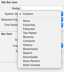
To configure the tab bar icon, go to the Item icon in the View Controller (not on the tab view controller) we just made and click it. This will bring up in the properties inspector the Tab Bar Item and Bar Item properties. In the Tab Bar Item properties is the System Item drop down. This is where we configure the tab bar button.
In the System Item menu, Click the drop-down for System Item. you will see a list of system icons.
Select Favorites. The Icon changes both on the view controller and the tab bar controller.

Click the other view controller’s tab bar, and change the system Icon to Recents.
Drag out six more view controllers, so we have a total of eight controllers. Control-drag from the tab bar controller to each new view controller and assign Contacts ,Bookmarks ,Search, Downloads ,and Most Viewed to the controllers, leaving one as a custom item. The tab bar controller should look like this:
Using More
Set the simulator to an iPhone 6. Build and run. While your icons may be in a different order, you will get something like this for the tab bar at the bottom of the phone:
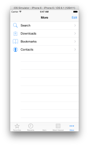
We get an extra tab we did not set up titled More. Tap on the More icon.
Compact widths cannot handle more than five tabs. If you add more than five tabs, it places a More tab as the fifth tab and makes this table view for you. If you tap the tab in the table’s cell, the tab’s controller will appear.
Without any more code, tab bar controllers let users customize their tab bars. Tab the Edit button, and you get a configuration view:
Drag one of the icons down to the tab bar. It replaces one tab. You can also drag tabs in the tab bar to change the order. Try getting the tab bar to look like in the above screenshot, then tap Done. Your tab bar now looks like this:
One of the system icons you can use is a More icon. Be careful when using the More icon in a tab bar. It can cause user confusion between the More tab and your own use for More.
Close the simulator. In the storyboard, delete three view controllers so you get a tab bar like this:
Since we now have five icons, this will keep off the More icon.
Custom Tab Bar Items
Click on the tab bar for the one custom controller.We can see all the tab bar properties.
The lower half has bar item properties, which directly control the title and icon for the tab. We can easily change the text. Change the Bar Item Title to Square.
The title changes on the tab bar:
If we change a System items’s title, it becomes a custom item, and the icon disappears. Click on the Contacts Icon. Change the title to Pizza. Do the same to change Downloads to Pie. All become squares.
Icon Images
Under Title in the properties inspector, we have a drop down for Image. For a custom bar item we can supply the icon. Image icons are not like other images. They are monochrome images, unlike anything else you have ever seen. They are set not by color but by the alpha value , or transparency of the image. You can make any image here any color, but it will show up as a solid tint color if you select an alpha value of 100% and background color if you select 0% alpha. For example I created the following icons in both high and low resolutions:
Icons are 30 points by 30 points, which means for retina images make the icon a 60 pixel by 60 pixel image and for low resolution images 30 pixel by 30 pixel. You can download them individually by right clicking the images above, and saving them to a folder. Use these file names:
You can also download a.zip file Of these here:Tab Bar Assets
For those not familiar with Apple image naming conventions, low resolution images have a file name. Retina Images have @2x appended to that file name. This tells Xcode to know what resolution it is. We have both 60×60 pixel retina and 30×30 pixel standard images. By loading both into Xcode, the system will use the correct one automatically for the device.
In Xcode’s navigator panel, open up images.xassets. Select both gradient bar icon files. Drag them into the center panel in Xcode, which will highlight, and the number 2 will appear next to your cursor. Release the mouse button, and you will see a new collection in the image assets.
Do the same for the pie bar and pizza bar files Select the pizza bar.png and pizza bar@2x.png files and drag them to the assets manager. Do the same for the pie bar.png and pie bar@2x.png buttons.
Return to the storyboard. On the tab we titled Square,click anywhere on the tab bar. Select the image drop-down in the tab bar properties and select the gradient bar icon.
Find the Pizza and Pie tab views on the storyboard, and change them the same way. The Tab bar controller now has three custom icons.
Build and run with the iPhone 6 simulator, and you will see our three icons, with one highlighted as selected.


